Design & Style
Many of the details guests notice when they stay — hidden spaces, unexpected materials, playful moments — come from a deliberate design approach rather than a fixed aesthetic.

Design Style at the cabin: How we dreamed up
the vacationist
We wanted our cabin to blend into its natural environment, complementing the farm, fields and trees around it, but also to be striking in appearance. We wanted our design style to bring alive the cabin experience to our guests and to be noticed as a leading example of what eco-glamping is all about. The question on day 1 was: ‘How do we go achieve that?’
We learnt from our American School Bus, Skoolie Stays, that people love the eye-catching ‘inside-outside’ contrast. The wow factor when you step inside to something wholly unexpected. That counterpoint was something we wanted to recreate in the cabin.
We decided on an organic and natural ‘modern log-cabin’ with a twist: the kind of interior you might find in a luxury hotel or apartment.
A wooden cabin for the 21st Century
The cabin is in a lovely sloping field, bordered by trees and bushes on all sides. To minimise the impact on the land, we built on a retired hay-bale trailer, something you often spot abandoned in farmyards or fields. This meant no foundations were required and we could also repurpose an unused piece of equipment.
Cladding the cabin in wood would allow us to blend in even further and also build as sustainably as possible, but we needed a solution that allowed for strong weather protection as well as the right look. After a good chat with our friendly neighbourhood Environment Protection Charity, the Brighton and Hove Wood Recycling Project, we realised there was a clear way forward: pallets.
Pallet wood: Eco-conscious cladding
Pallet wood is everywhere these days, and there is good reason it is so ubiquitous. Like shipping containers, wooden pallets are used all over the world in transport and logistics. Created from timber that is not suitable for other purposes, they are cheap to produce and readily available if you don’t mind removing all the nails holding them together.
As a creator and builder, there are many good reasons to love and use pallet wood. It is uniform to an extent in its cut and shape, and as with all wood, it varies in texture, grain, colour and patina. We loved the idea of using that to our advantage in building the cabin. Our exterior walls were to be our biggest canvas, and pallet wood was to be our paint.
The look and hue of the wood will age and colour naturally with time as our glamping cabin continues to blend in with its environment. We love the look and know others do too.
Interior design for glorious glamping
If the aim for the exterior was rustic, the interior had to be completely opposite. No pallet wood here!
But first we had to find that contrast and decide our style: the key that would unlock the design inspiration for us. For this we had to go back to the drawing board. In fact, we went further back than that: all the way to our 14,000 mile drive around the US in our first American School Bus, Skoolie No.1.
When inspiration strikes, wait a while!
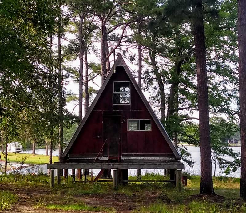
Whilst travelling around America in our Skoolie, the inspiration behind the launch of our glamping business, we spotted an A-frame cabin in the woods of Southern Georgia. It was nestled in the trees, evocative and cosy but at the same time the sharp angles looked modern and cool. We knew then we wanted one and so began to explore the idea of an A-frame on a trailer.
We soon realised the problem with A-Frames – mostly, they are very cramped near the top! To create enough space for four people to comfortably holiday, the base would need to be so big it wouldn’t work on a trailer and would need foundations, which not only impacts on the land but also requires planning.
Design is born from inspiration and for us great glamping accommodation really delivers when it carries a story and meaning. We realised we could not follow the plans of an A-frame exactly, but we could take elements of it and incorporate those into something new that we could share with our guests and enrich their experience. The A-Frame became the ‘origin-story’ of the cabin’s design motif: the triangle.
The Triangle: ‘story’ and ‘meaning’
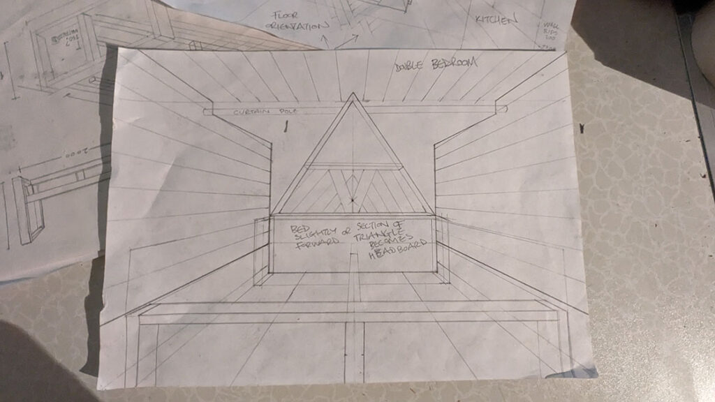
One of the first things our guests see is the huge triangular picture window in the bedroom. As the light spills out it is reminiscent of the A frame we spotted in Georgia. When you go inside, that same shape beautifully frames the trees and field outside, connecting you to the natural environment – an important feature for us.
Not to miss any opportunities for pleasing detail, we used the angles either side of the window to make floor-to-ceiling cabinets. These rise from narrower bases to splayed tops, further increasing the feeling of height in the room and drawing the eye to the clever workmanship of our carpenter.
With the A-frame in mind, we continued the triangle motif to the opposite wall – the head of the bed – and then created a mirror image of that triangle on the other side of the wall to take the motif into the living space.
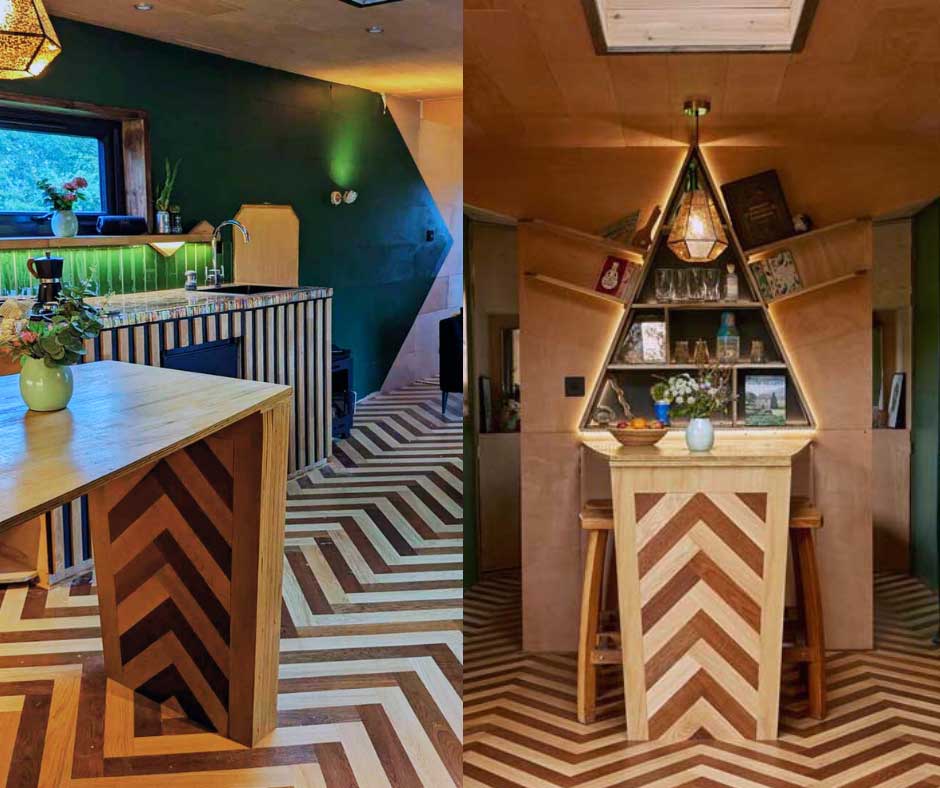
We’d already had the idea of an interesting feature-shelf area above the dining table, with echoes of cool bars and optics, and this now had a definite shape.
The flooring: angles that go with the flow
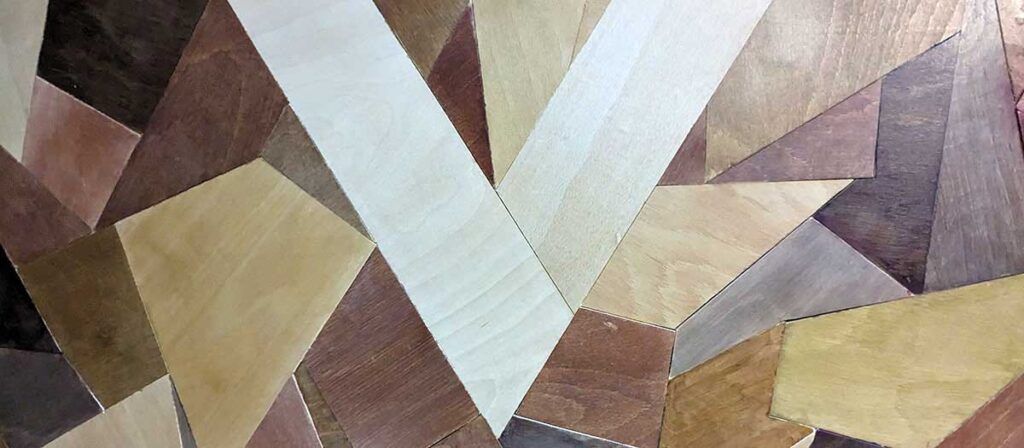
The flooring is an important part of the angular design. Using Havwood’s lovely engineered sustainable oak flooring in two high-contrast tones, ‘Pallido’ and ‘Bronzo’, we created a herring-bone design with the centre-line of the cabin creating a flow through the space. Read Havwood’s design article on our cabin build here.
With very striking triangles in the floor design, we decided to go all out and bring them upright, flowing up onto our dining table leg to create a centrepiece for the whole cabin. The result is a striking and cohesive design with beautiful symmetry.
The Kitchen: unexpected materials
The pencil worktop began as an experiment in material reuse — taking an object designed to be used briefly and discarded, and turning it into something permanent.
Thousands of unwanted pencils were set into resin to form a solid surface that is both practical and playful. It’s not presented as a statement piece, but as a reminder that sustainable choices don’t need to look worthy or austere to be meaningful. Like much of the cabin, it rewards curiosity rather than demanding attention.
Hidden Spaces
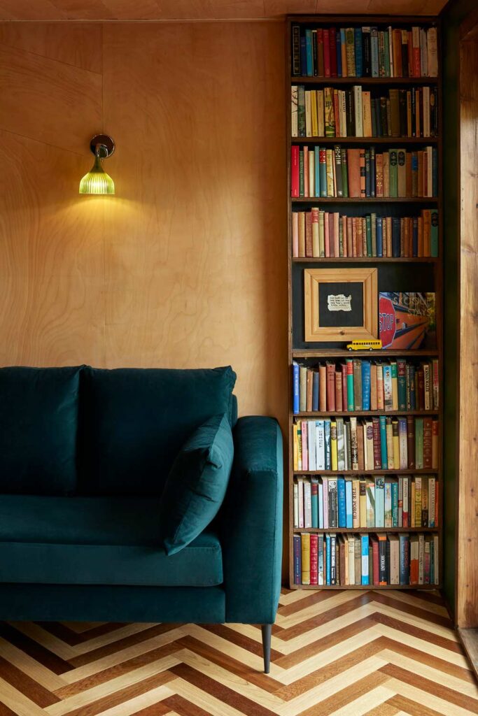
The secret bookcase door wasn’t conceived as a novelty feature, but as a response to space, reuse, and how children experience places differently from adults.
Using reclaimed books raised uncomfortable questions about waste, value, and what we choose to preserve — but it also created something that feels genuinely magical rather than staged.
The result is a hidden room that feels discovered rather than designed, and a moment of surprise that becomes part of how families remember their stay.
Lighting for the soul.
Good lighting brings a home to life. It can transform any corner from workplace to cosy nook. It affects and enhances our moods and casts a different light on any day or evening, if you can adjust it to suit the moment.
Being 100% off-grid and solar powered for our energy we had no limitations on lighting things up beyond keeping it subdued outside to minimise environmental impact. As such, you’ll find quite a few light-switches at The Vacationist! They will allow you to create different combinations of light and shade throughout, and always enhance the time you spend inside.
Choose partners, stylishly!
With our overall style clear, we wanted to ensure we worked with supplying partners for the interior design who both had solid eco-credentials and beautiful designs. Havwoods wooden flooring had set the bar high.
We were so happy to find Showerwall to become the major feature in our bathroom. Eco-friendly, stylish designs and oh-so-easy to install too, their acrylic showerwall panels are a revelation. We chose a light and simple geometric pattern, which works so well with our ply walls and pine ceiling.
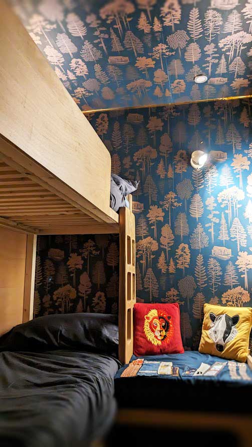
Mini-moderns wallpaper has more artistic designs in their portfolio than you could use in a lifetime. ‘Pattern with a Story’ is their by-line and that’s right up our glamping cabin path. For us, their Catskills wallpaper, in midnight and bronze hues, inspired by a stay in a wooden cabin in the Catskills, USA, was a clear choice. Featuring Red Pine, Eastern Hemlock, Yellow Birch and Quaking Aspen – and little wooden cabins a la Catskills mountains, makes the secret bedroom just perfect. And when we love a product, we don’t just put it where it is supposed to be. As with the floor boards, we took our wallpaper to another plane too: it looks great flowing up onto the ceiling in the secret bedroom!
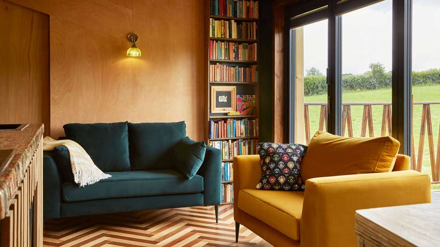
With a cosy cabin, you need somewhere cosy to sit. Brand new sofas often come with a fat carbon footprint, but we were delighted to find SofaStyle just down the road from us in Newhaven, Sussex. They are about providing local as well as global, using their electric vans, and they also have a range of super soft and comfy handmade sofas with coverings made using plastic bottles! Their wood is FSC all the way and designs are faultless. In each of our two small sofas in The Vacationist, there are up to 600 recycled plastic bottles. They are so soft, and so hardwearing with rich green and yellows complementing our design palette.
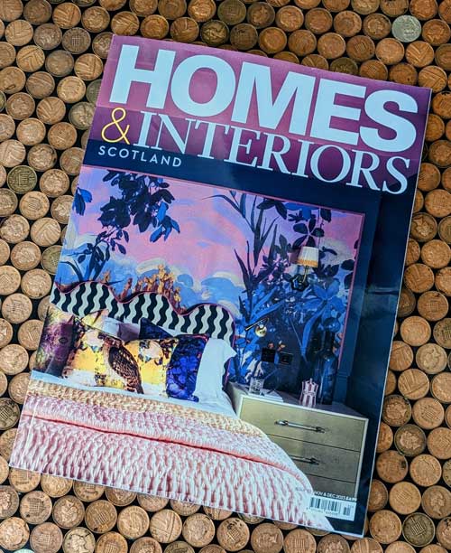
See the links below to read what HOMES & INTERIORS magazine and ECO HOME MAGAZINE had to say about our cabin design.


Eco + Design : 'An English Eccentric'
The eye-catching design of The Vacationist Cabin has been recognised in a few places. We are particularly happy to have the design noticed by those with an eye on sustainability. Our ‘modern log cabin’ may be clad in recycled pallet wood, and have eco-credentials running through its inner workings, but no corner is untouched by thoughtful design touches.
Eco Design Magazine called us An English Eccentric (which we rather like!) in their focus article on us. They said: “
“Located in the middle of a verdant meadow in the UK’s West Sussex countryside, this ecological wood cabin used to be a hay bale trailer. It combines sustainability, luxury and relaxation.
And it also provides a lot of home decor inspiration! Particularly its use of sustainable wood throughout the structure.”
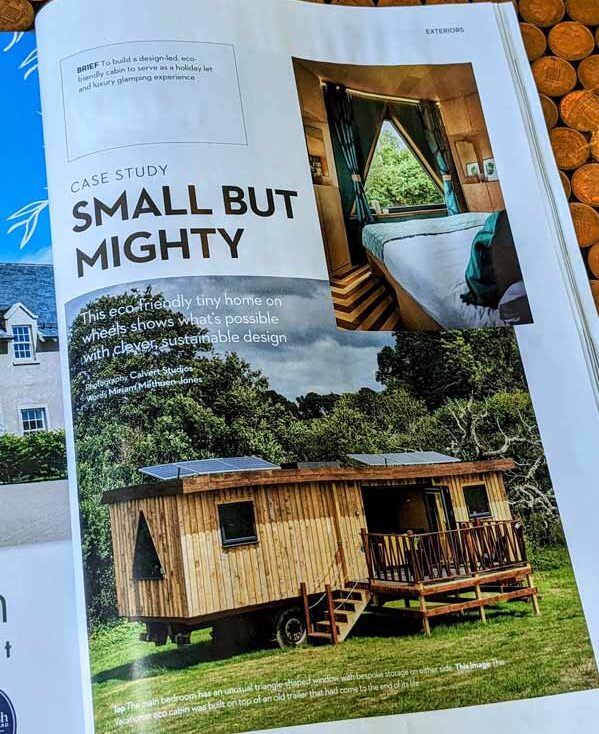
The Vacationist: 'Small But Mighty'
We were so pleased to get 4 pages in the November 2023 edition of Homes and Interiors Magazine Scotland.
With the tiny home movement clearly in mind, they dubbed us ‘Small but Mighty’, a tag we’ll wear with pride. They said:
“Inside there are intriguing design elements at every turn. Using repurposed and sustainable elements was of the utmost importance to Ruth and Guy, so each area was lovingly hand-built using a mixture of new FSC wood and reclaimed oak and larch.”



the accommodation
The cabin is all about being a home from home with all the comfort of your own safe place. Warmth and cosiness for winter months, expansive open spaces for warmer times.
An open living area encourages quality time for couples and families, and secluded individual bedrooms at opposite end of the cabin for privacy and sleep.
Peace and quiet, space to think and relax.

things to do
We’ve thought about this so you don’t have to.
Maybe go for a gin tasting and cocktail creation experience at DedBest craft distillery on the farm, just a meander through the fields away. Or head a short distance to the South Downs National Park for incredible walks and views.
If you want cosy pubs, this is Sussex – we’ve got a few locals we can recommend!


